
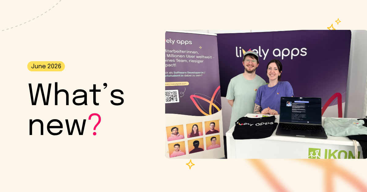
We live in Confluence.
If your team uses Confluence Data Center every day (for content, coordination, collaboration, and everything in between) you know how central it becomes to your workflow. But even as Confluence becomes more powerful, its out-of-the-box design often feels like it lacks something.
And with Lively Theme, we took on a challenge:
How do we make Confluence reflect our team’s character, not just its tasks?
We are a small team.
We care about:
- Clean interfaces
- Thoughtful design
- Tools that feel natural to use
We wanted our documentation, team spaces, and project notes to feel a bit more like “Lively Apps.” Not just efficient, but also beautiful and matching the brand identity.
How we added our brand’s identity across Confluence:
Confluence but make it ✨Lively✨

Logo & Header
What’s the first thing that comes to mind when you think of brand identity? That’s right - your logo! With Lively Theme, you can design a custom header that gives every Confluence page a personalized, branded feel. We’ve also added customizable links to help users quickly find exactly what they’re looking for.
Consistent color palette
Customize your dashboard to perfectly match your corporate identity! With Confluence’s built-in Look and Feel settings, you can easily adjust elements like button colors. Pair this with the Widgets from Lively Theme, and you’ll have a sleek, on-brand dashboard that stands out:

But that’s not all - you can also customize your menus and footer to create a clean, consistent, and personalized look across all your Confluence spaces.
The Outcome: A Space That Feels Like Home
- Reinforced brand internally
- Encouraged documentation through better UX
- Teams have a shared space that feels intentional
- Reduced friction in daily workflows
And it does all of this without overwhelming us with complexity. It’s flexible but lightweight - exactly what we need.
The set-up?
Easy-peasy. No complex configurations needed.
Design isn’t just decoration — it’s communication.
👉 Want to try it?
If you use Confluence on Data Center or Server, check out Lively Theme on the Marketplace.
You can also visit our documentation site to see examples in action.

.png)


.png)